LESSON: 7 Things You Can Do Right Now to Make Your Moodle Course More Accessible
This adaptive Lesson will provide you with background on accessibility, and seven concrete actions you can take now. There will be opportunities to test your knowledge as well.
3. Use Headers & Spacing
Using Headings and Spacing
If you are a user who relies primarily on sight, it's generally easy for you to quickly visually scan a website to see its overall structure, and to decide whether or not to skip down to a particular section of interest. Users who rely primarily on screen readers, such as the visually impaired, also scan webpages, but to do so, they rely on a page being organized with a proper structure--one that the screen reader they are using can correctly interpret.
In this case, the structure the screen reader is looking for is the organization of a document into sections using headings and sub-headings.
Structure is critical for adaptive technology users, who rely on properly formatted headings to understand and navigate documents and web pages. Without this structure, there is no easy way to navigate a document because the document is read as a single long section. (As a side-benefit, If you style your headings correctly and then later decide to change a font, weight, or size, you can make one global selection and all of your headings will change, saving you lots of time.)

Accessibility Pitfall
One common accessibility pitfall is to communicate the structure of a document or webpage not through the built-in semantic headers, but instead through visual cues only, such as making a section title 16pt font and bold. To a sighted user, this looks like a section heading, but to a screen reader, this information is lost.
Below is the screen that pops up when a screen-reader user uses the keyboard combination that tells the screen reader to read aloud the headings within the current page. In this case, the user will clearly be able to scan this document to get a sense for its overall structure, and can quickly jump to the section they would like to learn more about. But if the person writing this page hadn't used headers, the screen reader would have no information, or incorrect information about the structure of the document.
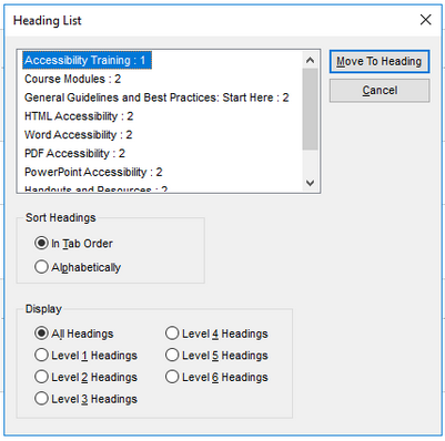
Image: UNT CLEAR
Headings and Moodle
In Moodle, highlight the text you’d like to make into a heading. In the Atto Toolbar editor, find the paragraph styles pull down menu (the A icon in the top left corner of the Atto Editor):

Choose the headings large, medium, or small, based on the hierarchy
of your written content, rather than your preferred size. Even if the
size feels inappropriately large or small on your screen, it will look
different to others depending on their own screen size and browser
settings. The important thing is to maintain that hierarchical
structure. Remember, adaptive technologies and phone access are
relying on properly structured and nested tags, so don’t go by size -- go
by logic and structure.
Use headings and spacing to group related content
Use whites pace and proximity to make relationships between content
more apparent. Style headings to group content, reduce clutter, and make
it easier to scan and understand.

Citations and links:
- White, K., Abou-Zahra, S., & Henry, S. L. (2019, January 9). Designing for Web Accessibility. Web Accessibility Initiative. https://www.w3.org/WAI/tips/designing/
- U of M Disability Resource Center. (n.d.). Headings. AccessibleU. https://accessibility.umn.edu/core-skills/headings